CASE STUDY
Unifying the UI across mobile and web for an AI-powered clinical pain assessment tool. Built to ensure accessibility, consistency, and rapid decision-making in high-pressure care environments.
Role: Product Designer
Tools: Figma
Team: 1 Product Desginer

Click to zoom
Colours
A tokenized, accessible palette
A tokenized, accessible palette designed for clinical reliability and cross-platform clarity. Structured across neutral, brand, and semantic tiers to ensure intuitive information hierarchy and zero ambiguity during assessments.

Click to zoom
Tokens
A robust token taxonomy
A robust token taxonomy mapping raw colour scales to contextual UI roles like surfaces, media, and containers. Designed to eliminate guesswork during development and guarantee consistent visual hierarchy across the app.

Click to zoom
Icons
A pixel-aligned icon
A pixel-aligned icon set engineered with clear optical weights and scale variants.

Click to zoom
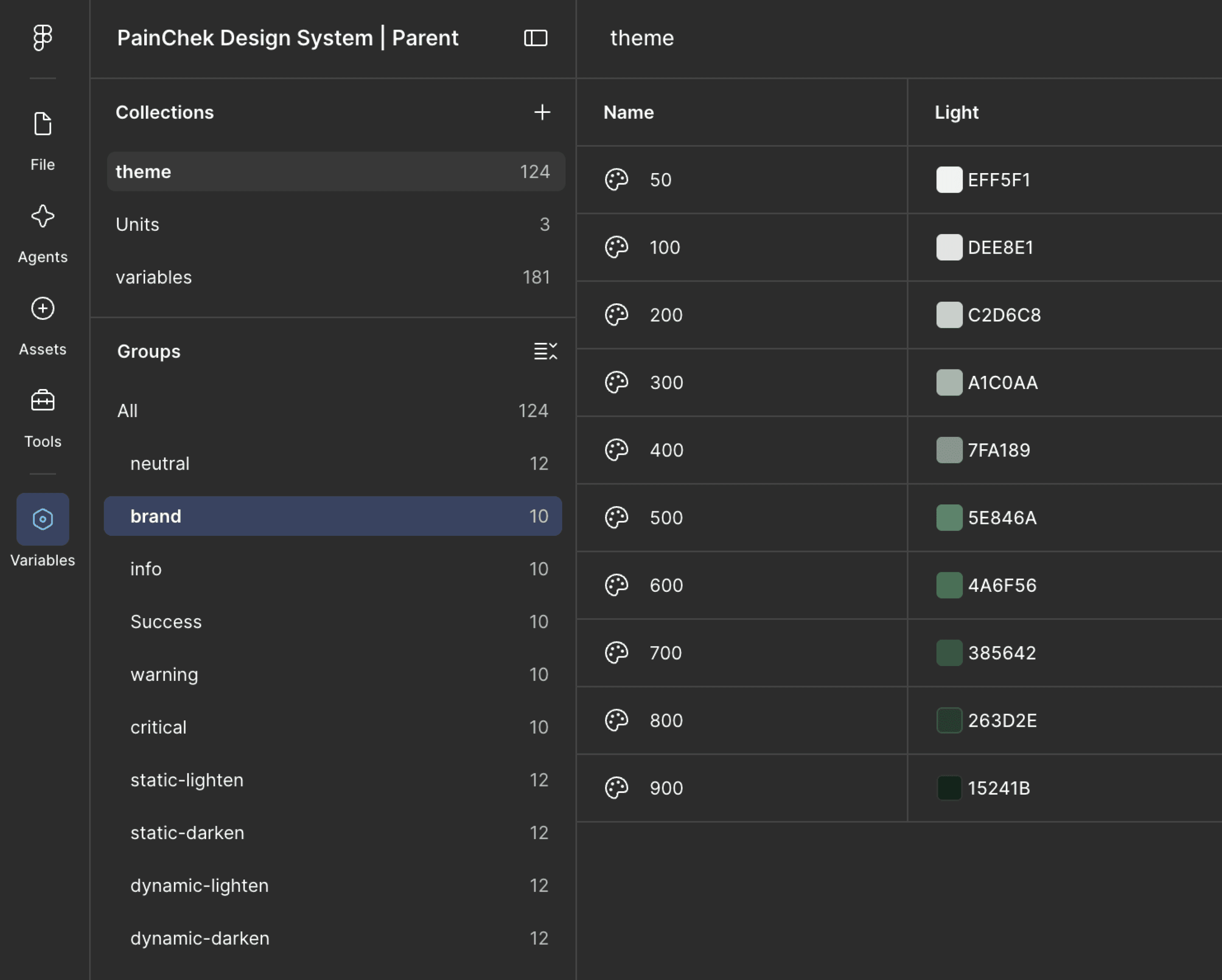
Variables
Centralised variable infrastructure
A centralised variable infrastructure structuring colour scales, dimensions, and themes into modular collections enabling effortless mode switching and consistent global maintenance.
Click to zoom
AI-Handoff to devs
Using Figma tokens and MCP to handover code
I requested for gitlab access and connected designs with dev environment using Figma MCP for faster execution with high quality

Click to zoom