CASE STUDY
Role: Product Designer
Tools: Figma, Figma Make, Claude Design, AI Plugins, LLMs
Duration: 3 years
Team: 1 Product Designer, 1 Product Owner, 1 Business Analyst, 5 Developers, 4 Testers
daily booking value
new sites in 3 weeks
on the offline build
faster to a result

Click to zoom
Introduction
A trusted directory that stopped at the moment of decision
Context
Australia’s #1 camping and outdoor travel app, engaging over 300,000 monthly active users. Built for offline reliability, it features a community-driven database of 60,000+ campsites where listings, photos, ratings, reviews, and fees are powered entirely by travellers.
The problem
Despite a large, loyal community, product growth had stalled. Site submissions had flatlined, discovery was clunky, and users regularly left the app to book elsewhere, causing the business to miss key revenue targets.
Core objective
Modernize the experience and evolve WikiCamps from a passive campsite directory into an active, bookable travel companion without alienating a habituated user base.
Research
Discovery & Research Insights
To uncover why user growth and listing contributions had stalled despite strong brand loyalty, four data lenses were cross-referenced to connect behavioral numbers with qualitative pain points.
Funnel & event analytics
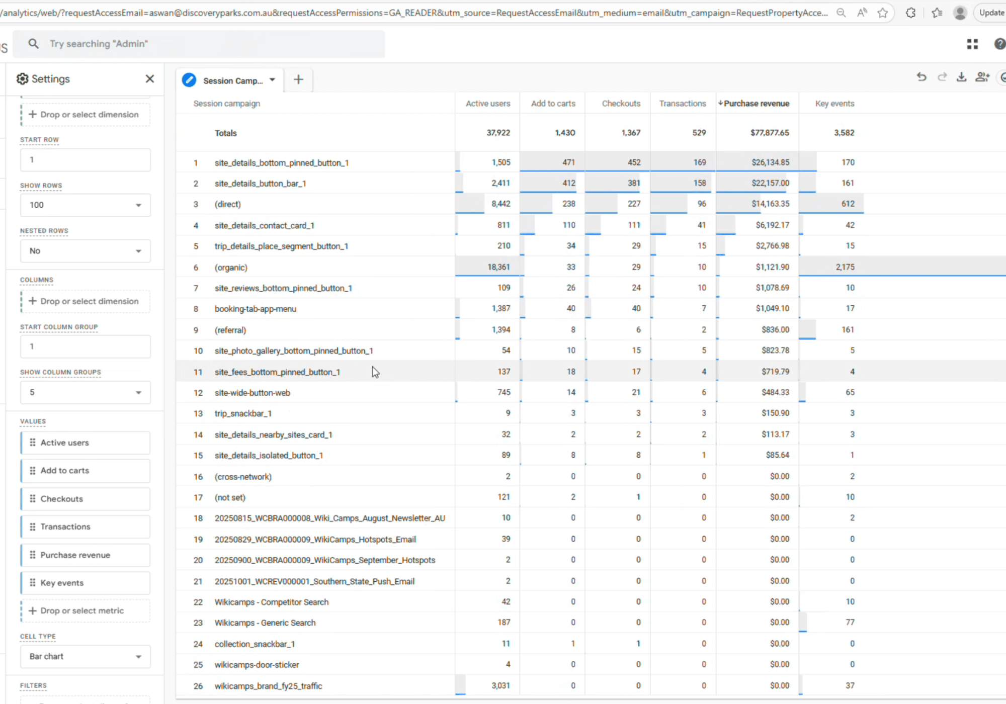
Amplitude and Google Analytics. Which screens carried traffic, and where in the funnel booking intent actually appeared.
Heatmaps on live screens
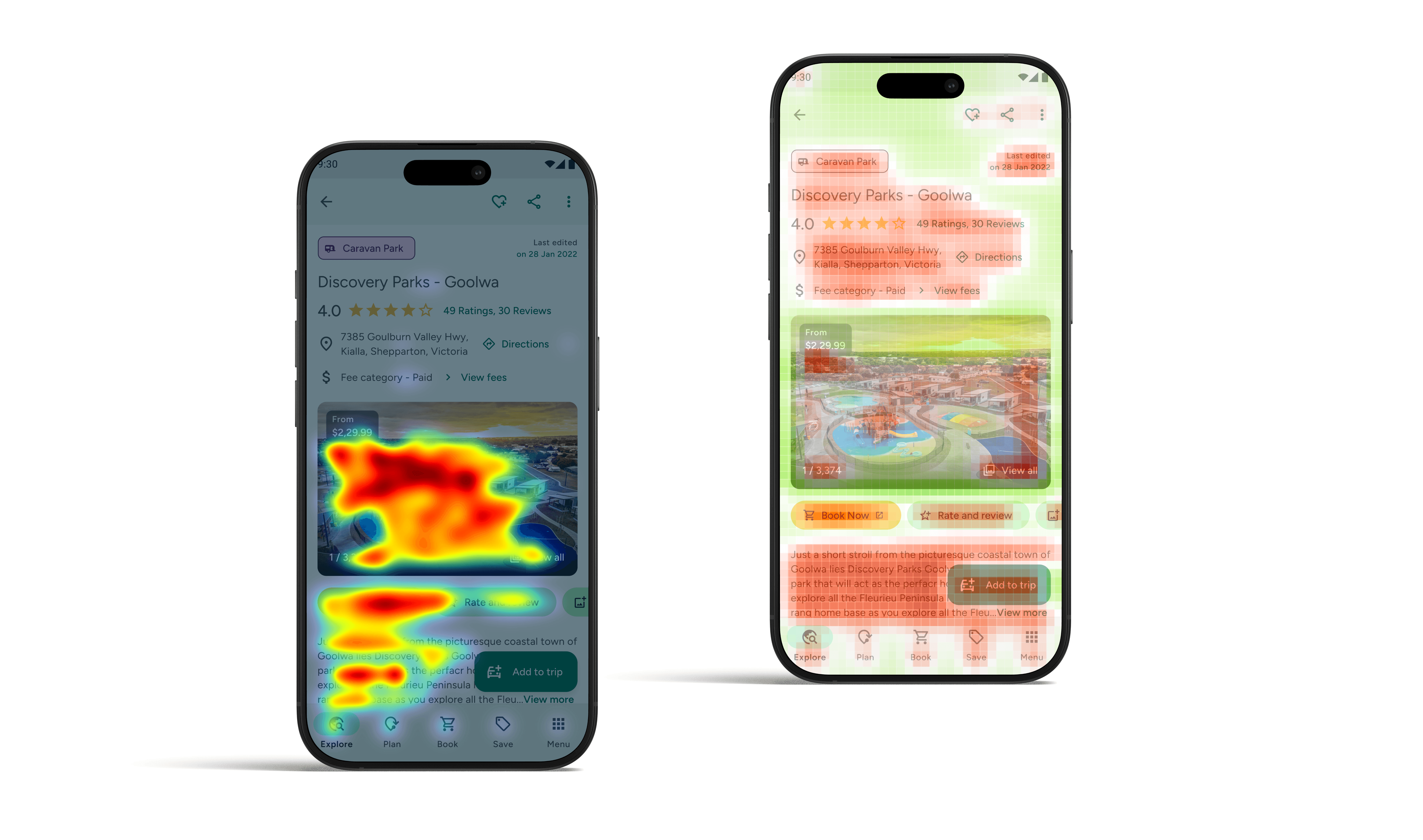
AI heatmap plugins showed real attention distribution. That was the basis for reordering the site page and moving the primary action.
User research and Testings

Travellers running real tasks. Find a site, judge it, add one, book it. On prototypes and on shipped builds.
Reviews, tickets & social
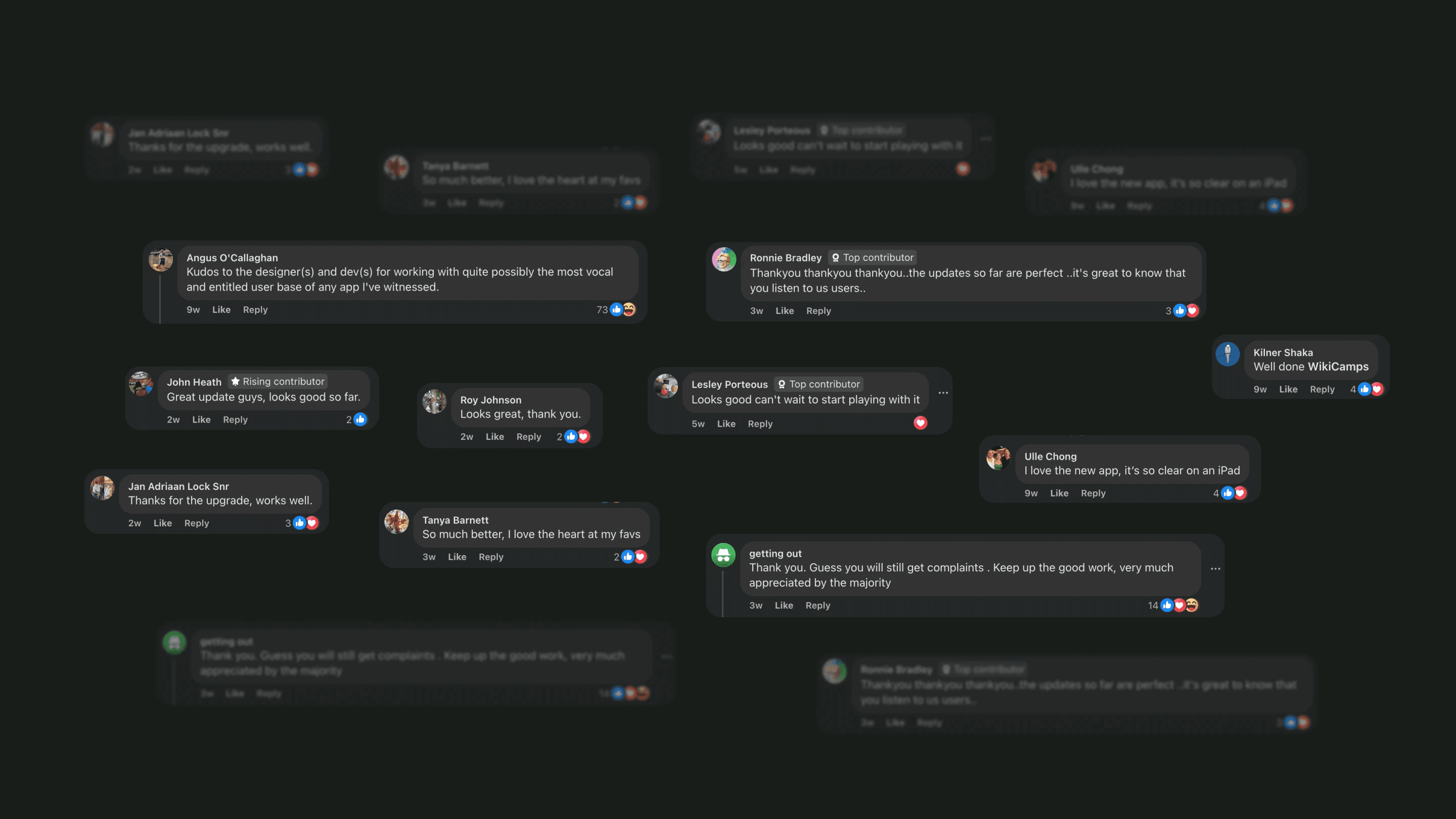
App store reviews, support tickets and social channels. Clustered with AI, then read by hand.
Solution: Add a site
Add a Site Flow
Problem
Adding a Site Was Too Hard
WikiCamps was known for having the largest site database, but new submissions flatlined while rivals caught up. The entry point was hidden away, and the form asked for every single field before letting you save, so people gave up.

Click to zoom
Solution
Prominent button with a split flow
I moved the "Add a Site" button to the main landing screen where users could easily see it. Then I redesigned the form to collect only basic info first, leaving optional details for later.
Shipped

Click to zoom
THE RESULT
5,000+
new campsites added within the first three weeks of release.
Solution: Booking revenue
Book Now Button and Intent Touchpoints
Problem
Bookings Happened Outside the App
Booking revenue was low because there was no direct way to book inside the app. Users picked a campsite on WikiCamps and then left to search for it on Google, which cost the business direct booking fees.

Click to zoom
Solution
Persistent buttons where intent is highest
Put clear booking buttons across the whole user journey: map cards, a sticky bottom bar on site details, and inside the trip planner.
Shipped

Click to zoom
THE RESULT
$5,000 → $32,000
jump in daily booking order value
Solution: Discovery hub
Home Page and Discovery Hub
Problem
The Map Overwhelmed New Users
The app launched straight into a dense map covered in pins. Casual campers and first-time users felt lost and had no clear place to begin searching or planning trips.

Click to zoom
Solution
A dedicated discovery home screen
A simple home page with search shortcuts, popular trips, recent searches, and offline status cards.
Shipped

Click to zoom
THE RESULT
$5,000 → $32,000
jump in daily booking order value
Design system
Dev handover ready design system
A component library on Material 3, built with accessibility and Figma Tokens and used across the application.

Click to zoom
Old vs New design
A quick view of the changes

Click to zoom

Click to zoom